
Y-Eat
Y-Eat: Reimagining Breakfast for a Fast-Moving World
In today's cities, breakfast is increasingly becoming the meal people skip. Busy schedules, long commutes, and demanding routines leave little time for preparation, creating a gap between convenience and nutrition. Y-Eat was created to address this challenge with a healthier, more practical alternative for modern lifestyles.
The Brief
Rather than positioning the product as a beverage, we positioned it as a drinking breakfast—a complete meal designed for people on the move. The opportunity was to create a new consumption habit around convenience without compromising on nutrition, quality, or freshness.
The Reframe
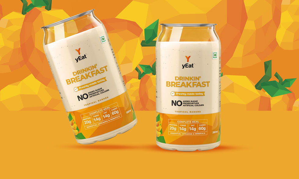
Y-Eat was built around a simple but powerful proposition: a ready-to-drink breakfast made from ingredients such as oats, milk, and nuts, produced fresh without relying on heavy preservatives. To support this positioning, we designed a packaging system that prioritised clarity and readability. The visual language was intentionally minimal, allowing consumers to immediately understand the product, its benefits, and its role within their daily routine. The can design reinforced convenience, portability, and ease of consumption, making the product feel naturally suited to life on the go.
The Strategy
The packaging helped establish Y-Eat as a distinctive offering within the health and convenience food category. By clearly communicating the concept of a drinking breakfast, the brand created immediate relevance among busy consumers looking for practical nutrition solutions. The result was a product that felt modern, accessible, and purpose-built for contemporary lifestyles, helping Y-Eat gain strong acceptance and build momentum within its category.
The Outcome


Business Purpose and Brand Purpose Are Not the Same
Onam Rush: Don’t Forget Your Reputation
