

Sapins
Sapins: Reimagining a Dairy Brand for a New Generation
Sapins Dairy had built recognition in the market, but its identity no longer reflected the aspirations of the brand or the expectations of modern consumers. As the category became increasingly competitive, the brand needed a more cohesive and contemporary presence that could communicate quality, trust, and relevance while appealing to a broader audience.
The Brief
Rather than treating the project as a visual refresh, we approached it as an opportunity to redefine how the brand was perceived. The goal was to create an identity that felt more premium while expressing the values increasingly important to consumers—purity, responsibility, sustainability, and authenticity.
The Reframe
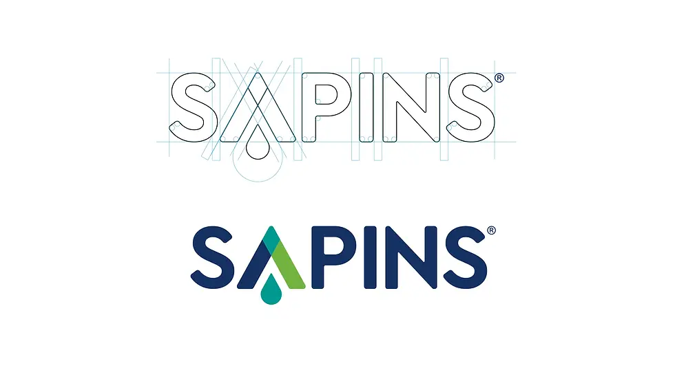
We developed a refined brand identity system that brought greater consistency and clarity across the brand. The logo was enhanced with softer, more contemporary forms, creating a friendlier and more approachable character. A carefully curated palette of teal, blue, and green introduced a sense of freshness, trust, and natural goodness while helping the brand stand apart within the category. The visual language was designed to communicate purity, ethical practices, and a forward-looking perspective, while also reflecting themes of inclusivity and empowerment.
The Strategy
The rebrand gave Sapins Dairy a more premium and contemporary presence in the market. The enhanced identity strengthened brand recognition, improved visual consistency, and created a stronger emotional connection with consumers. The result was a dairy brand that felt modern, credible, and well-positioned for future growth while remaining rooted in the values that had earned consumer trust.
The Outcome


Business Purpose and Brand Purpose Are Not the Same

Onam Rush: Don’t Forget Your Reputation
