
Agna foods
Agna Powder: building trust through simplicity
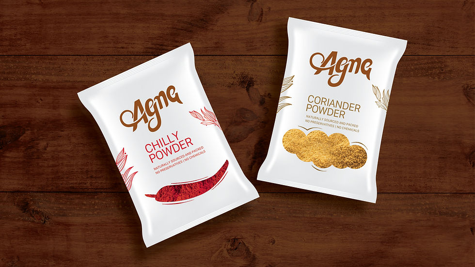
Agna Foods was created with a simple ambition—to bring locally sourced and locally processed spices to consumers who value authenticity and quality. As a new entrant in a highly competitive category, the brand needed to establish trust while differentiating itself from the visual clutter that dominates the spice aisle.
The Brief
Rather than competing through loud claims or decorative packaging, we saw an opportunity to let the product speak for itself. The strength of Agna Foods lay in its local roots, straightforward approach, and commitment to delivering spices with minimal intervention. The packaging needed to reflect those values with clarity and honesty.
The Reframe
We developed a minimal packaging system built around transparency and simplicity. The design reduced unnecessary visual noise and focused attention on the product itself, allowing consumers to see what they were buying. Clean layouts, restrained graphics, and a natural visual language helped communicate authenticity, quality, and trust without relying on exaggerated cues often seen within the category.
The Strategy
The packaging gave Agna Foods a distinct presence while remaining true to its values. By emphasizing simplicity and product visibility, the brand was able to communicate a sense of authenticity and credibility from the shelf. The result was a packaging system that felt natural, approachable, and aligned with the expectations of consumers seeking honest food products.
The Outcome


The list every brand forgets to write

The name communicates the brand
